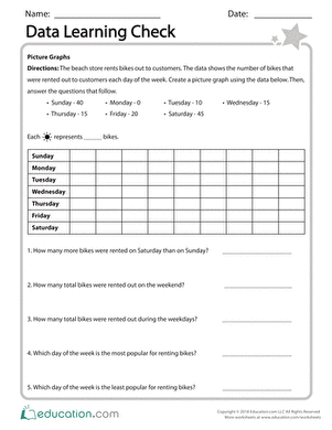
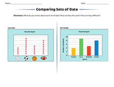
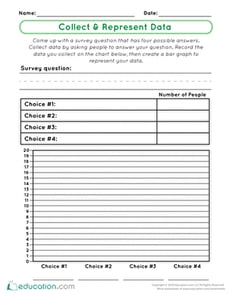
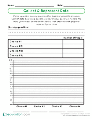
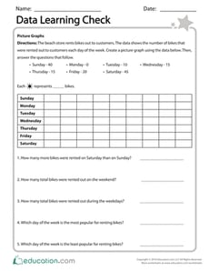
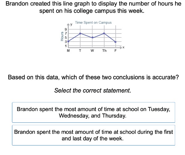
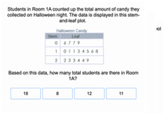
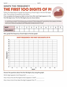
SKIP TO CONTENT

Data and Graphing Educational Resources

718 results
Math
Sort by:
718 results
Sort by:

Data and Graphing Educational Resources

While not everyone will become a data scientist, teaching students data skills will serve them well as an adult. But just because you know it’s important to understand data sets, doesn’t mean you feel completely comfortable teaching data skills, or the math needed to work with data. Take advantage of our printable worksheets and exercise ideas to help you lead classroom activities that facilitate a greater understanding of data.
One of the most common ways to communicate data is with a graph. But there are so many different kinds of graphs! Each type of graph has different visual strengths. Consider these different ways to represent data:
  • Line graphs – Lines work well to show how something changes over time. They show how a trend rises, falls, or becomes unstable.
  • Bar graphs – Bars are good when your data is divided into different categories. For example, you can show how many trees of various species grow in your neighborhood.
  • Pie graphs – A pie graph is excellent at showing proportions. For example, if you want to see what activities you do most during the day, a pie graph will quickly communicate the relative size of your time spent sleeping, eating, playing, and working.
  • Scatter points – Scatter points are dots on an x-y graph for when you have numerous measurements. They show a large quantity of data and the variety of that data. Using a line, you can also chart the average or show the trend. For example, you could measure the temperature every day for a year. Scatter points will show that some days were very, very hot, and others were unusually cold. But the average line will show overall warmer days in the summer and cooler days in the winter.
Once you’re done practicing skills related to data, keep the concepts coming with our math resources related to time.